The application provides an easy way to define and edit validations parameters of certain controls. The types of the controls are listed below:
- Masked Text Box
- Text Box
 How to access the validations function:
In the designer, if every selected control’s type is one of the above their context menu will contain enabled item Validations… and Remove Validations menu items. The Remove option displays only if any of the selected controls already has a validation applied.
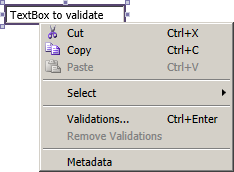
Using the menu item Validations… (or the keyboard shortcut Ctrl+Enter) the Validations window is open.
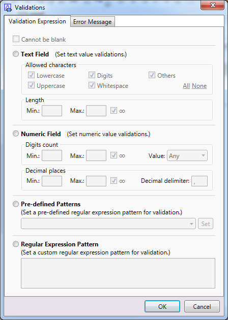
The Validation Expression tab:
| Section/Item | Sub item | Description | Note |
| Cannot be blank | The element must not be left blank. | ||
| o Text Field | Group of options that define a valid input text value. | ||
| Allowed characters – | Lowercase | The lowercase characters are allowed. | [1] |
| Uppercase | The uppercase characters are allowed. | ||
| Digits | Digit characters can be entered. | ||
| Whitespace | Whitespace characters are accepted. | ||
| Length – | Min. | Minimum number of characters required. | |
| Max. | Maximum number of characters allowed. | ||
| ∞ | When checked the maximum length of the text is not limited (overrides the Max value).
|
||
| o Numeric Field | Group of options that define a valid input numeric value. | ||
| Digits count – | Min. | Minimum number of digits required in the integer part of the number. | |
| Max. | Maximum number of digits allowed in the integer part of the number. | ||
| ∞ | If this option is marked, there is no set upper limit for number entry. | ||
| Value | Allowed type of value:
– positive (greater than or equal to zero values) – negative (lesser then zero values) – any |
||
| Decimal places – | Min. | Minimal number of decimal places required in an entered number. | |
| Max. | Maximal number of decimal places in a number. | ||
| ∞ | Checking this option removes the upper limit for the number of decimal places. | ||
| Decimal delimiter | Determines the character to delimit the integer and the decimal parts of the number.
|
||
| o Pre-defined Patterns | Email Address | Pre-defined regular expression pattern from the list – an email address (example of valid value: jsmith@example.org). | * [2] |
| IPv4 Address | One of the pre-defined patterns – IP address version 4, format: ###.###.###.### (values from 0.0.0.0 to 255.255.252.255). | ||
| Positive or negative percentage | Pre-defined pattern – accepting values from “-100%” to “100%”. | ||
| URL without protocol | Pre-defined pattern – an URL address without the protocol part – e.g. submission.e-government.ge | ||
| URL with protocol | Pre-defined pattern – an URL address without the protocol part – e.g. https://submission.e-government.ge | ||
| URL with optional protocol | Pre-defined pattern – an URL address with or without the protocol part | ||
| o Regular Expression Pattern | This field shows the generated regular expression pattern and allows directly editing it. |
[1] All options in the Allowed characters group can be easily toggled at once – the All button checks and the None button unchecks them.
[2] It is necessary to confirm the selection of the pre-defined pattern from the drop-down list with the Set button.
 The Cannot Be Blank option cannot be used separately only in conjunction with the Text Field, Numeric Field or Regular Expression Pattern groups.
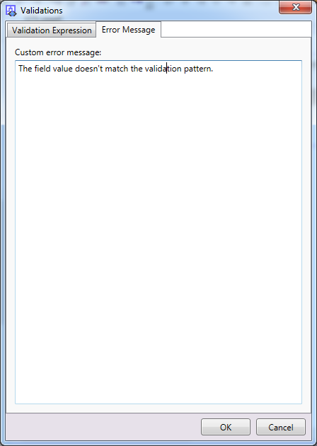
Error Message tab:
This tab is intended to edit /define custom error message, which will be displayed if the user leaves the element and validation conditions are not met.
Clicking the OK button validates entered values.
If there is trouble with the entered values, an error message will be displayed,
e.g. “There are some problems with the values on the forms: – Value ‘Regular Expression Pattern‘ cannot be empty.”,
otherwise the validation is set to all the selected (Masked) Text Boxes.
Clicking the Cancel button discards all changes in the dialog and closes it.
It is possible to set and show validation messages of text boxes and masked text boxes in code. For more details see Custom validations page.