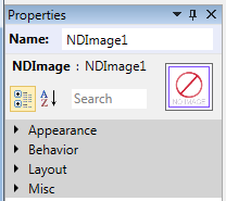
This panel lists a set of properties of the focused control in the current form designer and allows to set the values of the properties.

Upper part of the panel displays the type and the name of the focused control; the name is generated when the control is drag & dropped from the Toolbox or a control is copied. The name can be changed as long as it is unique for the whole form.
Panel also displays a preview of the focused control to for easy orientation designing forms.
To ease finding specific properties the panel contains the Search field that filters the properties.
Groups of properties
Additional properties are displayed in the panel in accordance with the type of the focused control.
Control properties are divided into several groups:
- Appearance
- Behavior
- Content
- Layout
- Miscelaneous
Setting the properties of controls
Different editors are used to set values of the properties depending on the type of individual properties:
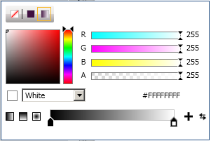
Setting a brush property:
A solid color brush can be set directly by entering a known color name (e.g. White, Black etc.) or a color in the #AARRGGBB format (e.g. #FF804020):

The editor’s popup provides list of known colors and other means to define a null brush, solid color brush, a gradient brush or a radial gradient brush.
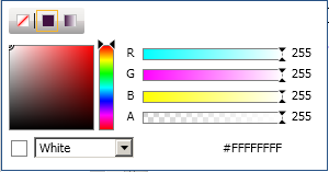
- When the Gradient brush option is selected, a gradient brush can be defined by a set of gradient stops.
 The popup can be closed using the Enter or Escape keys.
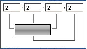
Setting a thickness property:
Setting a thickness value can be done by entering 1, 2 or 4 numbers separated by commas or spaces…

…or the numbers can be entered in the popup fields.
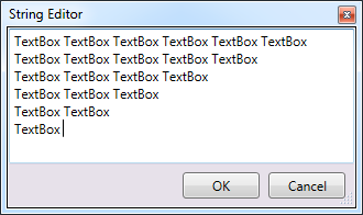
Setting a text property:
Text can be entered directly:
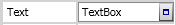
The button on the right side opens a string editor that allows easier editing of more extensive texts.
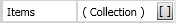
Setting a collection property:
Items in the collection editor can be added, removed or moved forward and backward. Editor also allows setting values of the properties of the individual items, as described in the Setting a … property sections of this document.
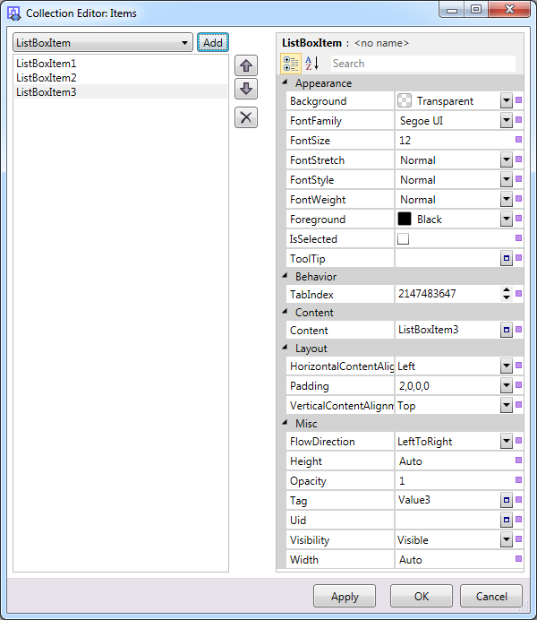
Clicking the OK button saves the changes in the collection and closes the window.
Clicking the Cancel button discards all changes and closes the window.
 The build-in controls Combo Box, List Box, Data Grid and others utilise the collection editor.