This designer control provides a flexible way to display a collection of data in rows and columns. The DataGrid provides three built-in column types – check box, text and combo box with a drop-down list).
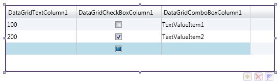
The designer adorner of the focused DataGrid control displays three additional buttons:
The  button adds a row.
The  button deletes the selected rows.
The  button sets selected cell to enabled / disabled state.
 The Data Grid control has a built-in mechanism to display row numbers in its row headers. Whether the numbers are shown depends on setting of value of the property ShowRowNumbers and also property HeadersVisibility must bet set to value Rows or All.